On RNAseq normalization
Normalization is necessary in transcriptomic analyses because the number of reads assigned to a gene depends on how deeply the sample was sequenced and on what else was in the library, so two samples cannot be compared until those effects are removed. However, there are many different methods, and new students sometimes have a hard time understanding what each method does and when to use them. For this purpose, I wanted to show the outcomes of different normalization procedures, using a visualization I am quite fond of: densityHeatmap from Zuguang Gu’s ComplexHeatmap package.
This uses 198 esophageal carcinoma samples from TCGA: 184 primary tumor, 1 metastatic, and 13 adjacent normal. The analysis script downloads the data and produces the normalization figures; the explainer script produces the figures in the next section.
Getting the data
TCGAbiolinks queries the GDC, downloads the per-sample count files, and assembles them into a SummarizedExperiment:
q <- GDCquery(project = "TCGA-ESCA", data.category = "Transcriptome Profiling",
              data.type = "Gene Expression Quantification",
              workflow.type = "STAR - Counts")
GDCdownload(q)
se <- GDCprepare(q)
cts <- assay(se, "unstranded")
That is 198 files and about 0.8 GB. Restricting to protein-coding genes and dropping the ones with too little signal to inform anything leaves 17,884 genes across 198 samples:
cts  <- cts[rowData(se)$gene_type == "protein_coding", ]
dge  <- DGEList(counts = cts, group = factor(grp))
keep <- filterByExpr(dge, group = factor(grp))
dge  <- dge[keep, , keep.lib.sizes = FALSE]
The filtering step matters for what follows. Genes that are near zero in every sample make each density collapse into a spike at the bottom of the plot, and the differences between samples stop being visible at all.
How to read a density heatmap
ComplexHeatmap::densityHeatmap() is great for visualizing many density curves next to each other, and is my go-to tool when the number of samples exceeds ~20, where something like a ridgeplot is no longer feasible. It draws one column per sample, but I have found that it can take some extra explanation to be able to read these dense figures.
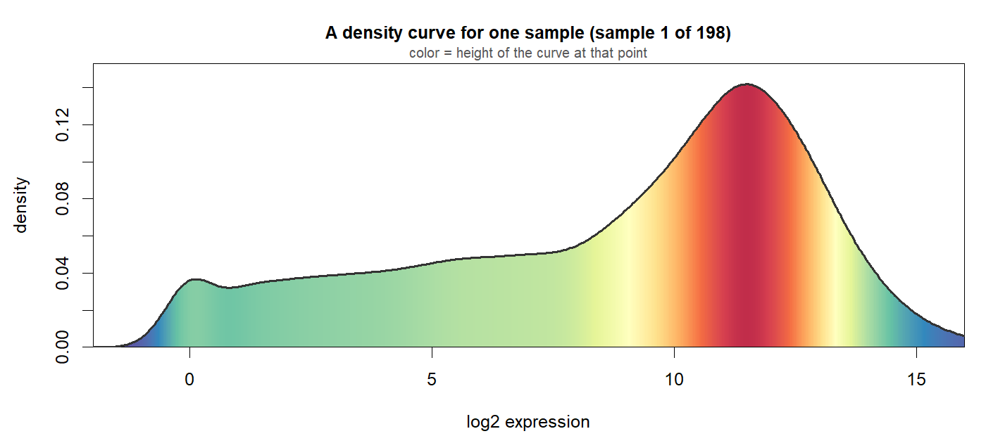
Start with one sample and one ordinary density curve. Below, the area under the curve is filled with the color scale the heatmap itself uses, so a tall part of the curve is red and the low parts are blue:
Now turn that curve on its side so expression runs up the page, and stretch every horizontal slice out to the same width. The shape is gone and only the color is left. That strip is a single column of the heatmap:
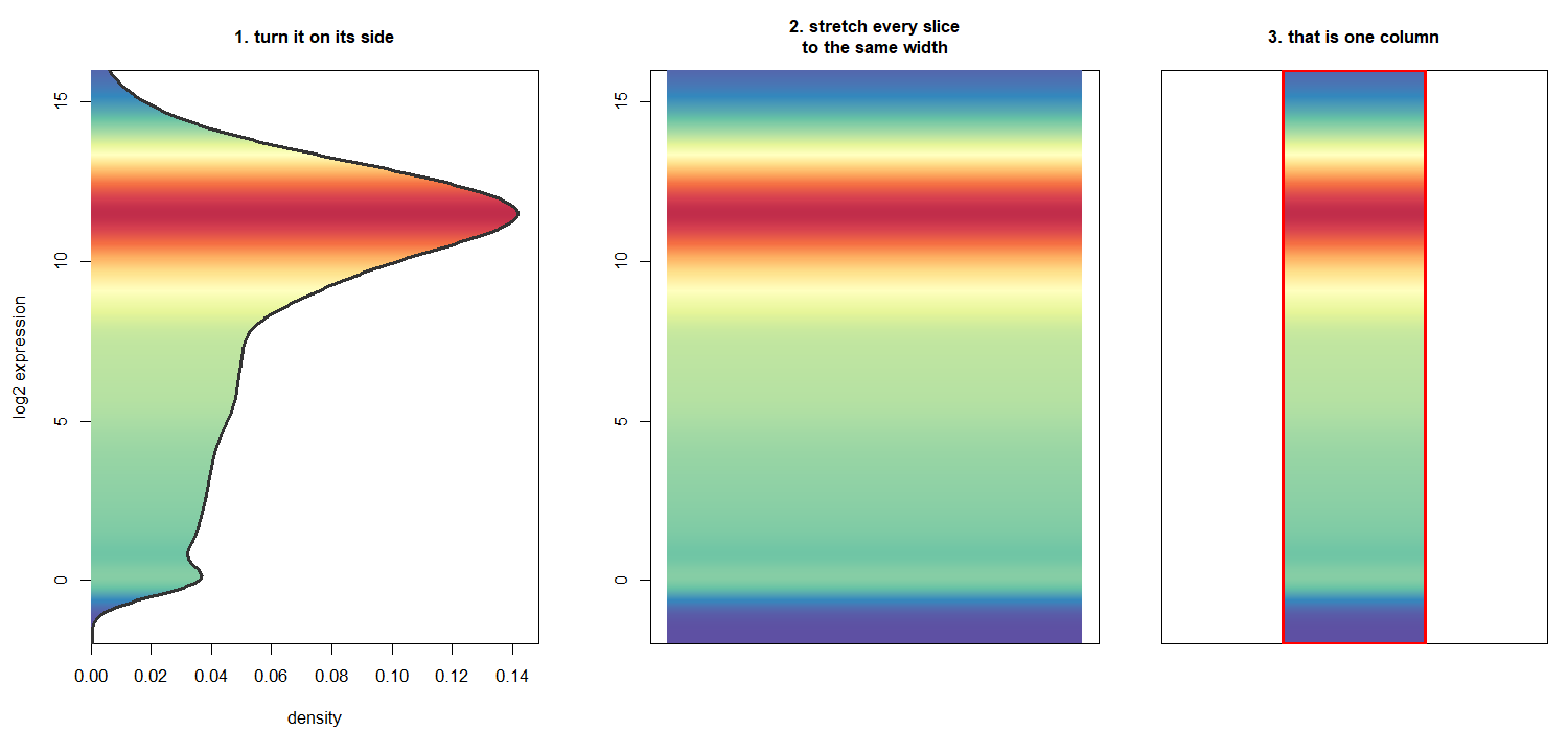
The height of the curve has become the color of the strip.
It is easier to see why that works in three dimensions. Give each density curve some thickness and it becomes a solid: the profile is the curve, the height is the density, and the top face carries the color. Now rotate the camera overhead. Looking straight down the density axis, every slice of the solid projects to the same footprint however tall it is, so the height stops being visible as shape and survives only as color:
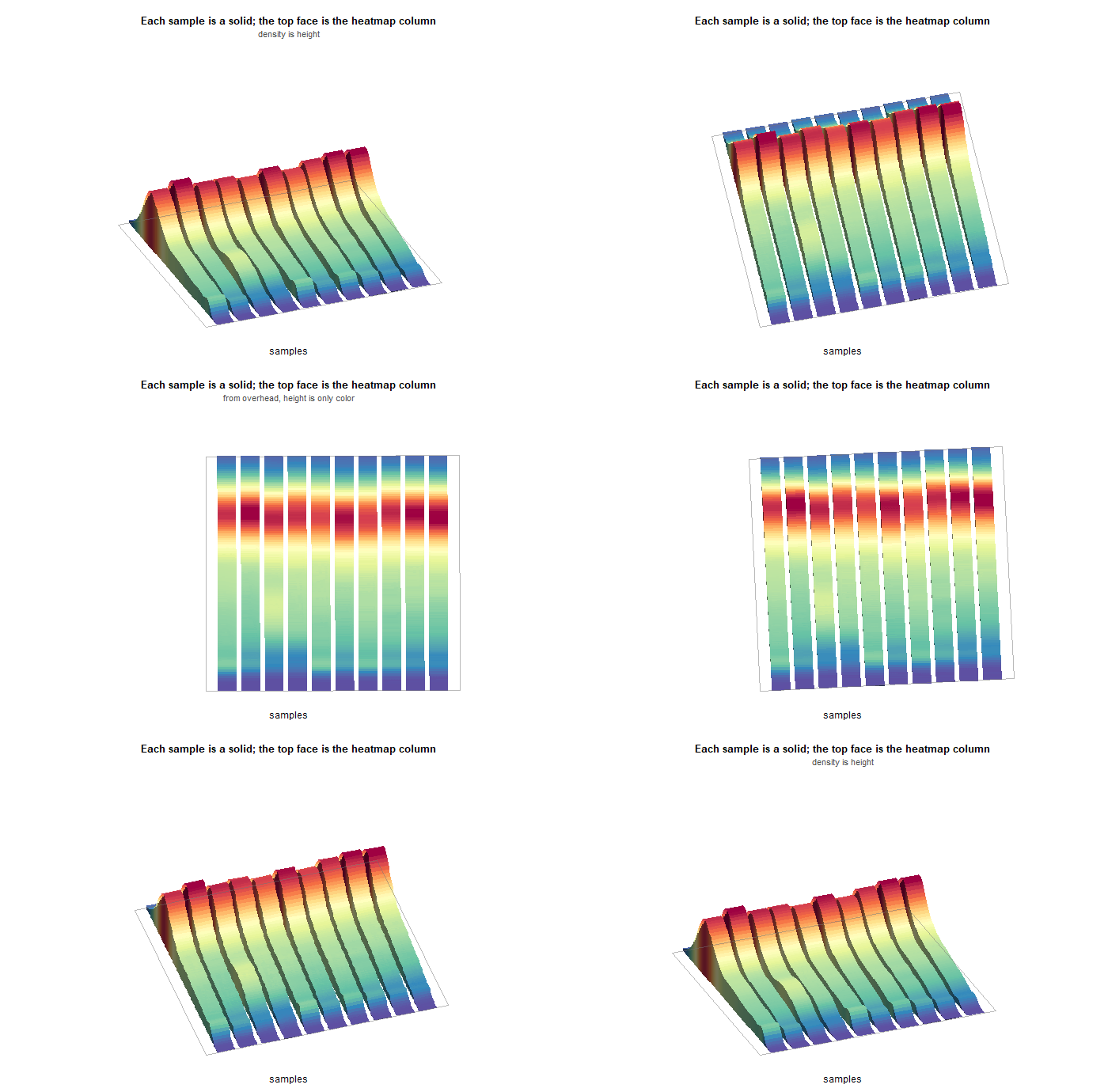
Standing all 198 of them side by side gives the real figure.
Here is the sample from the first two figures, outlined in the finished plot:
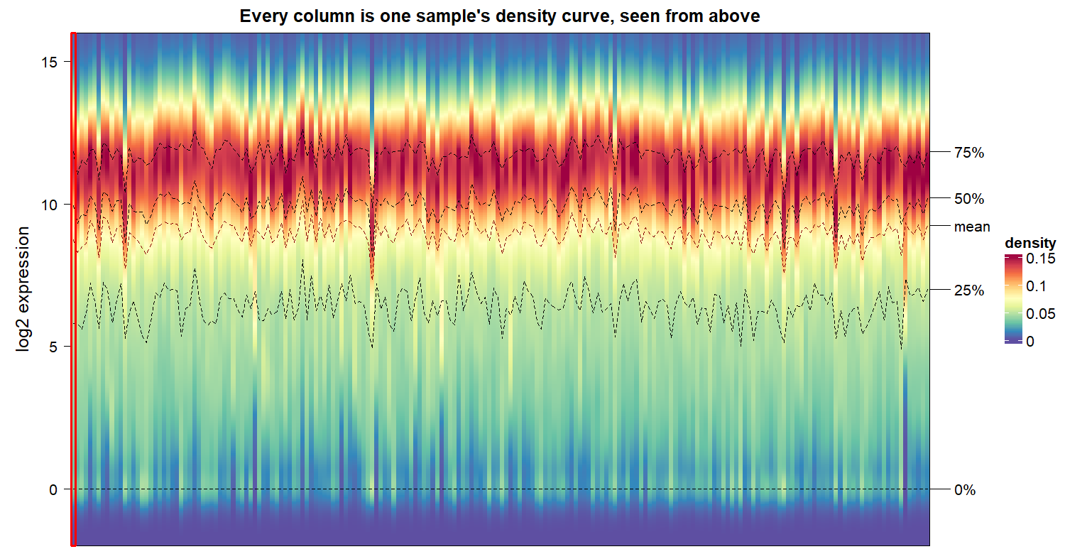
The dashed lines are the quartiles of each column, so they trace the 25th, 50th and 75th percentile across samples.
Seeing that it needs normalizing
densityHeatmap(log2(cts + 1), ylim = c(-2, 16), ylab = "log2 expression")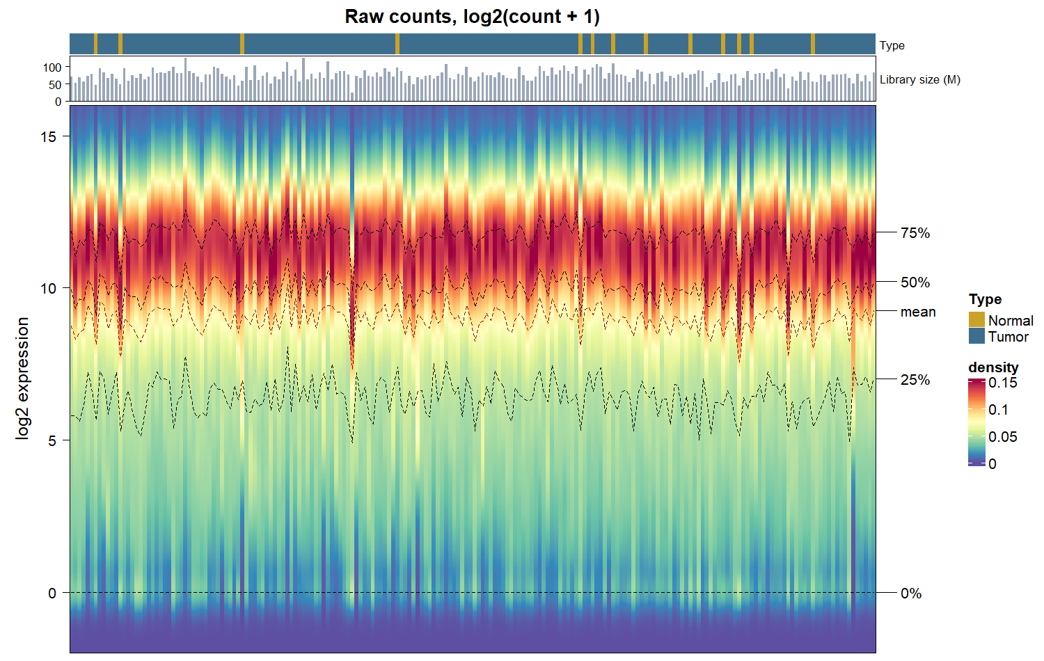
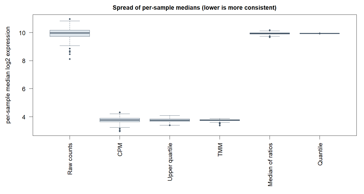
Looking at this plot, there are some clear differences in the scales of some of the samples. The median runs across a range of 2.86 on the log2 scale, a factor of 7.2 between the lowest and highest sample.
The library sizes at the top span 24.5M to 124.4M reads, a 5.1-fold range, so one obvious explanation is sequencing depth.
CPM normalization
Counts per million divides each sample by its own total and multiplies by a million.
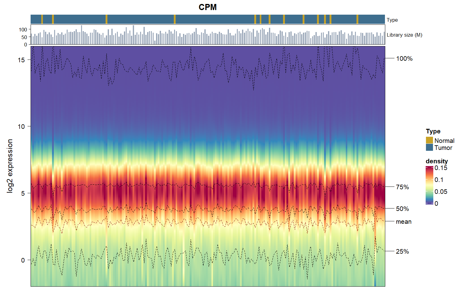
Depth really is most of the problem in this cohort. Plotting each sample’s median against its library size shows it directly, and shows what CPM does about it:
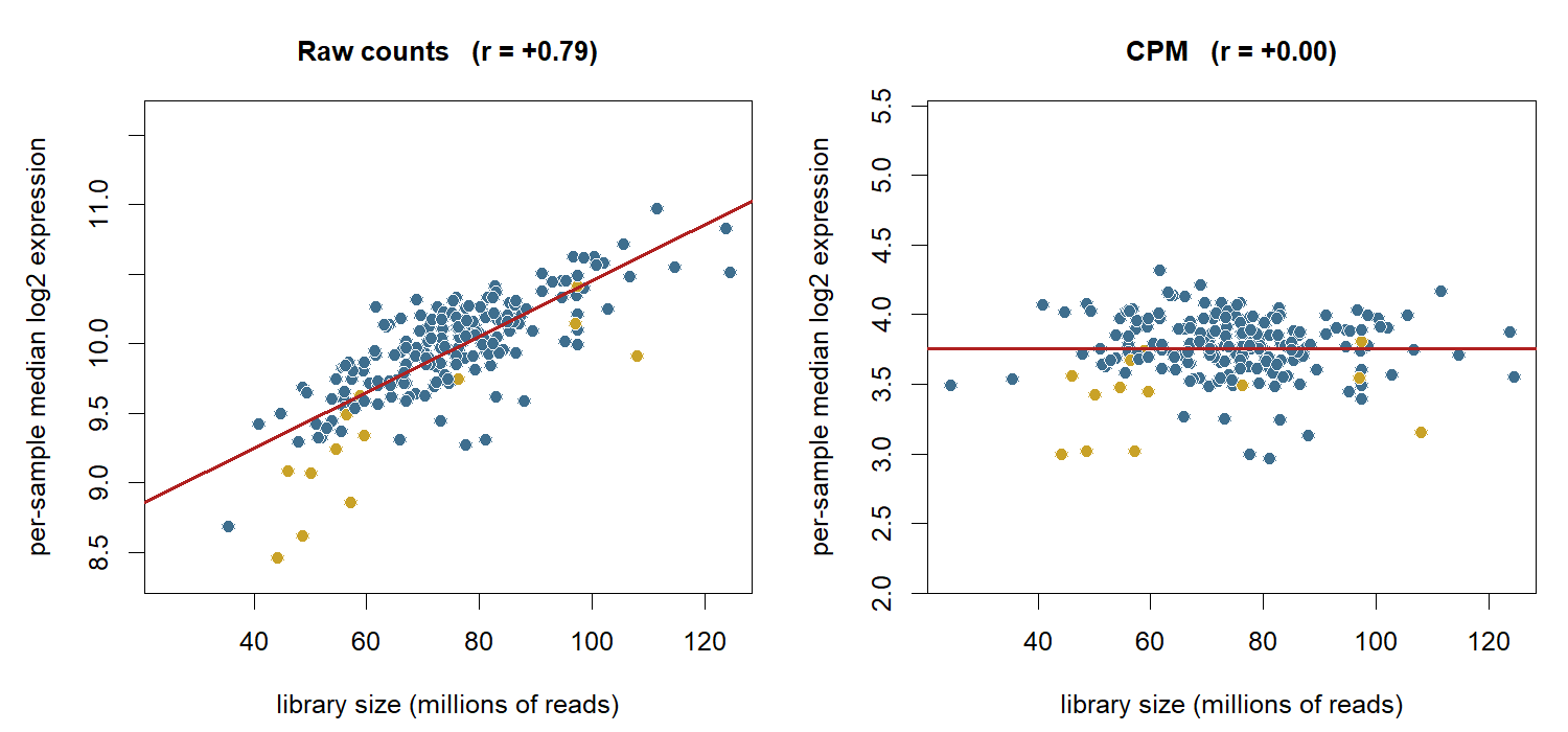
The raw medians track sequencing depth closely, at a correlation of +0.79, which accounts for about 62% of the variance between them. CPM removes that relationship completely: the correlation drops to +0.00 and the fitted line goes flat.
It does not finish the job, though. The spread of medians falls from 2.86 to 1.35, so 47% of the original spread is still there after the depth effect is gone. That residual is composition rather than depth.
The reason a library total is an imperfect divisor is that it is not evenly sourced. In these samples the top 100 genes account for between 16% and 60% of all reads, with a median of 24%:
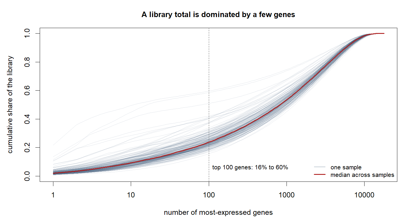
A library total is dominated by a handful of very highly expressed genes, so dividing by it means dividing by a number that mostly reflects those genes. If one sample happens to be dominated by a few transcripts, its total is inflated and every other gene in it gets pushed down.
Scaling on more robust statistics
Upper quartile, TMM, and median of ratios all compute one scaling factor per sample, like CPM does. They differ in what they compute it from. Instead of the total, each uses a statistic that ignores the extremes.
Upper quartile scales each sample by its own 75th percentile.
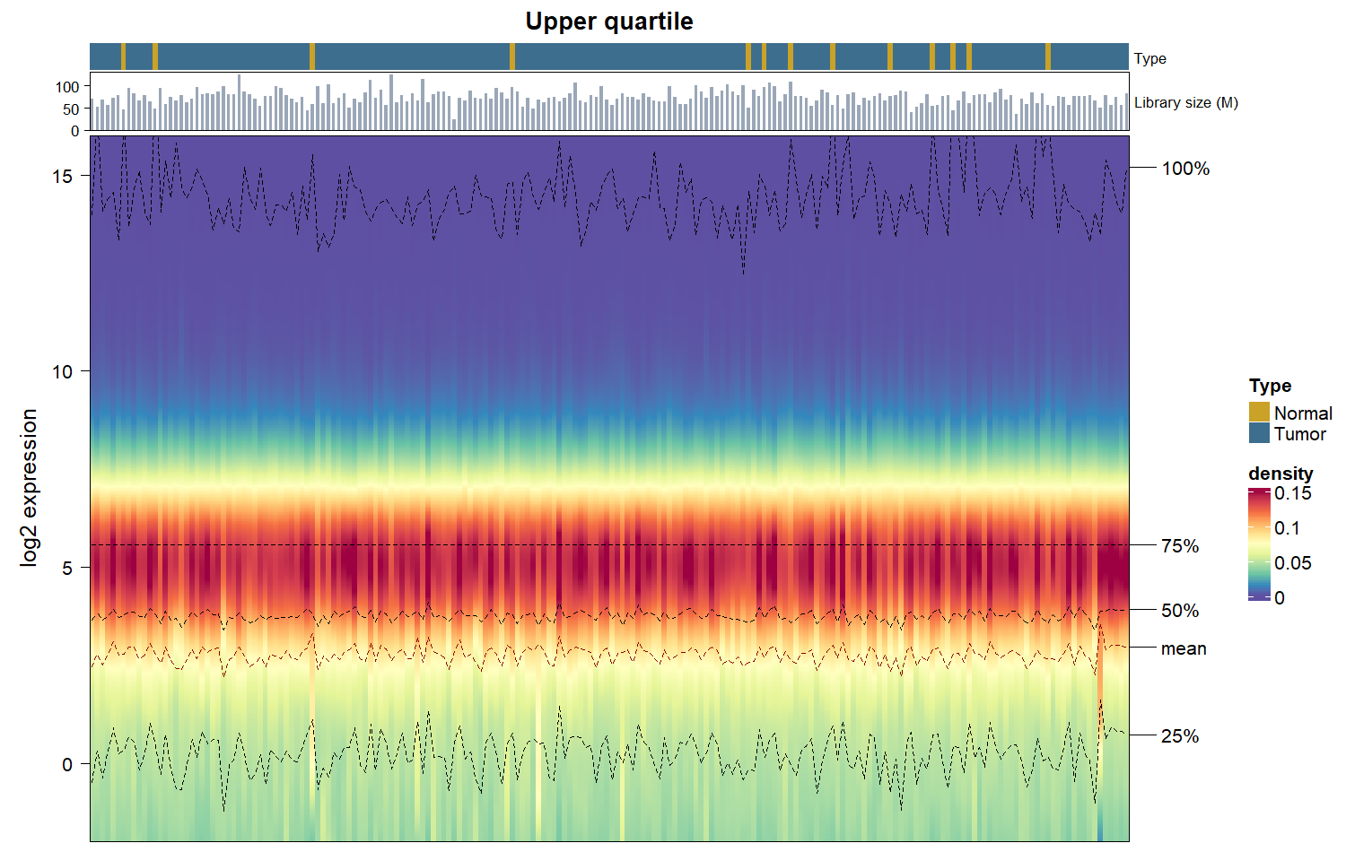
The quantile lines on this plot make the difference very easy to see. The 75% line is perfectly flat. The 25%, 50%, and 100% lines still wander, there is still variation within samples, but the upper quartile has been fixed.
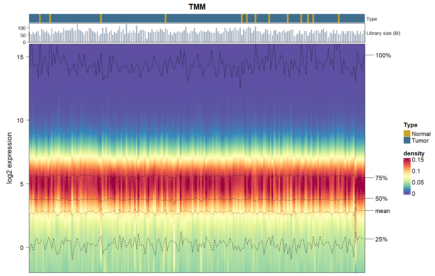
TMM takes a trimmed mean of log ratios against a reference sample, discarding the most extreme genes by expression and by fold change before averaging.
Median of ratios This it the default used within DESeq2. It divides each gene by its geometric mean across samples and takes the median of those ratios per sample.
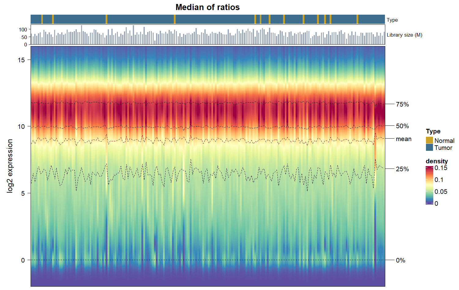
Both flatten the middle of the distribution rather than one quantile of it, and they land in nearly the same place. The spread of medians falls to 0.51 for TMM and 0.49 for median of ratios, against 0.69 for upper quartile, so roughly 17 to 24% of what it was in the raw data.
Quantile normalization
Quantile normalization is extreme, and is almost never the right tool. It forces all quantiles to be the same, flattening out most of the data.
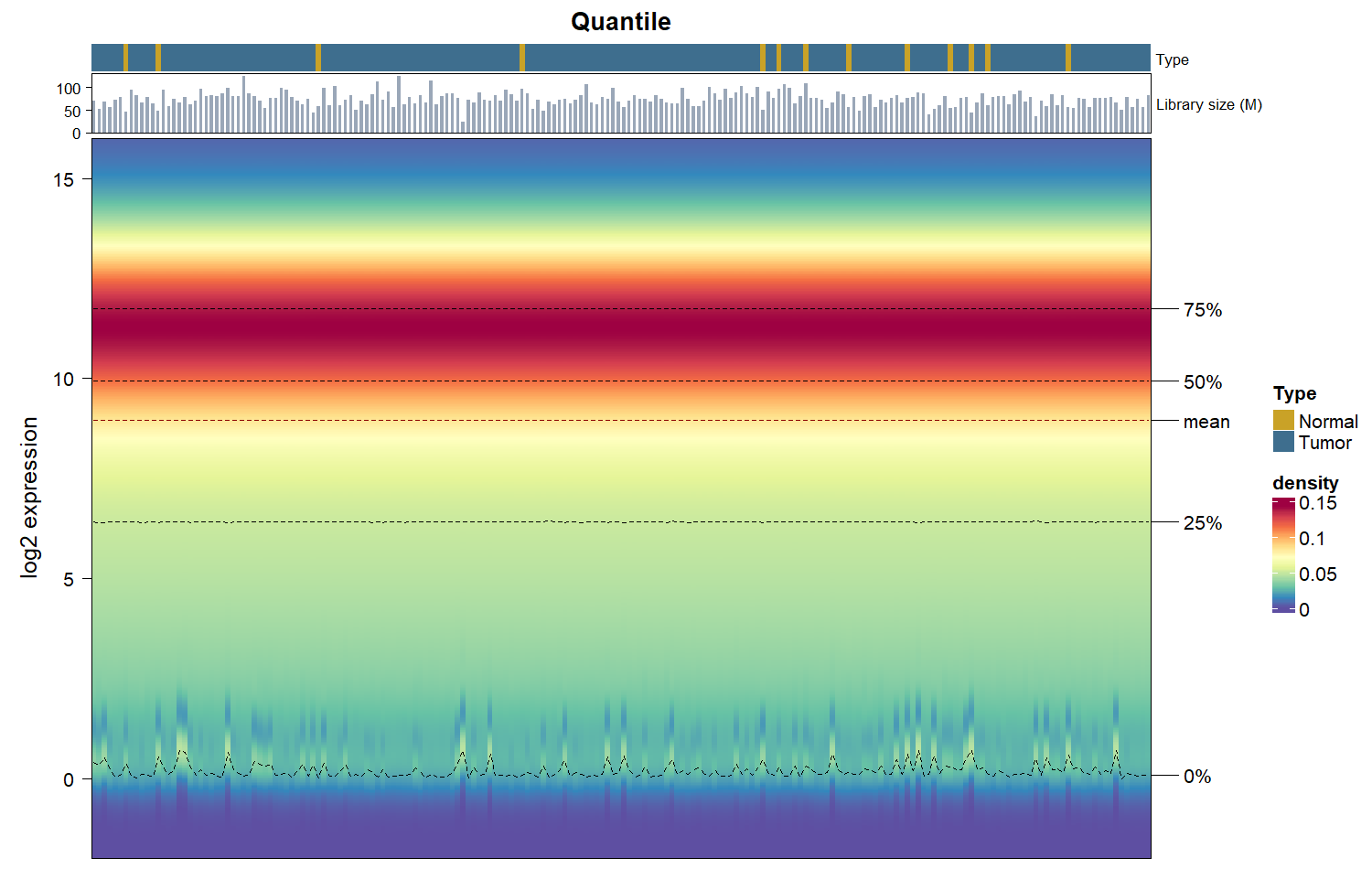
Every other method here leaves the shape of each sample’s distribution alone and shifts it; quantile normalization overwrites the shape. The interquartile range makes the distinction concrete:
| Method | Spread of medians | Spread of IQRs |
|---|---|---|
| Raw counts | 2.855 | 2.844 |
| CPM | 1.353 | 2.831 |
| Upper quartile | 0.694 | 2.832 |
| TMM | 0.511 | 2.841 |
| Median of ratios | 0.493 | 2.837 |
| Quantile | 0.003 | 0.031 |
Every scaling method leaves the IQR spread at about 2.84, because multiplying a sample by a constant shifts its log distribution without changing its width. Only quantile normalization changes that column, and it drives it to zero.
If the samples genuinely differ in spread for a biological reason, quantile normalization removes that difference along with the technical one, and nothing downstream can recover it.
What to use
- CPM is fine for exploratory looks and for filtering thresholds. It corrects sequencing depth, which was the largest single effect here, and leaves composition untouched.
- TMM (edgeR) and median of ratios (DESeq2) are the defaults for differential expression for good reason. They handle composition, they agree closely, and they leave each sample’s shape intact. Use whichever matches your testing framework.
- Upper quartile is a reasonable middle ground and is what TCGA’s own
fpkm_uq_unstrandassay uses, and is also used in transcriptomic deconvolution methods like DeMixT, since it preserves variation in medians while recuing the effect of outliers. - Quantile normalization is standard on microarrays and is used for RNA-seq when distributions must be identical. It is the strongest assumption on this list.
Regardless of what method you use, having the tools to visualize and see how your data looks before and after normalization help to guide these decisions.
Counts are from the GDC, TCGA-ESCA, STAR - Counts workflow. Figures use ComplexHeatmap::densityHeatmap.